Monday 9 May 2011

Final Social Media Pages

Facebook


This is the final Facebook page. It includes the profile image and I have posted photographs and videos from previous years Film Festivals.


Twitter


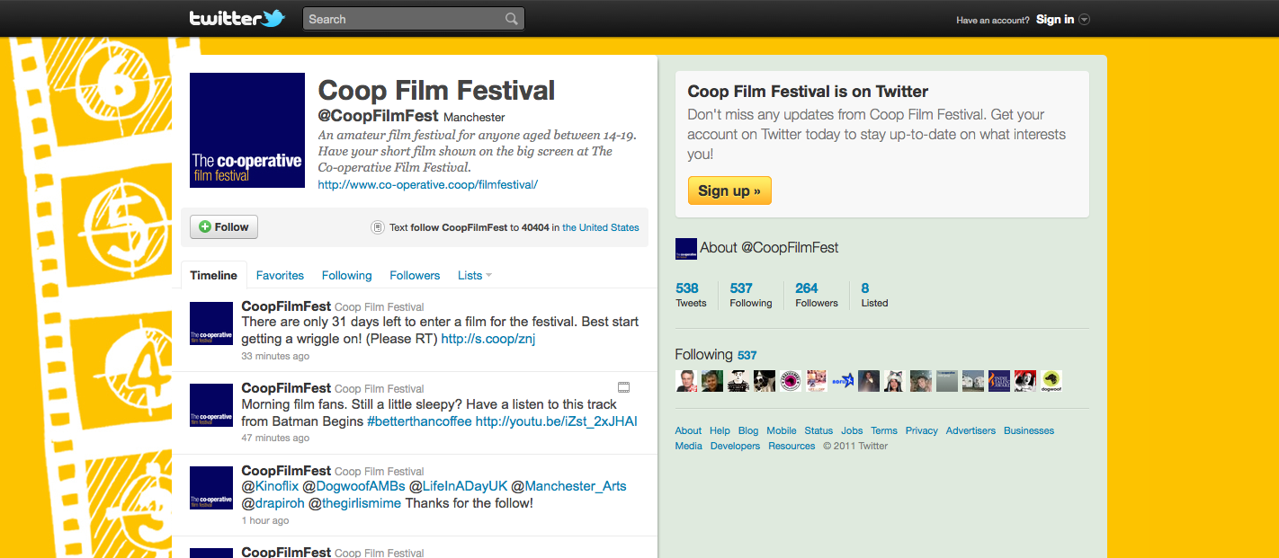
This is the personalised Twitter background I have created. I wanted it to fit with the posters and website so I have used the same background and assets but re sized it to the size of the Twitter page.


The background was then added to the Twitter page and I have populated it with tweets and video posts.


YouTube


The YouTube background is the same as Twitter but has been sized. This is to retain consistency throughout the campaign.


The text boxes and boarder were changed as well as the background so the page looks more personalised and part of the film festival brand.

Profile Logo

A logo needs to be designed to be used as the profile picture for Facebook, Twitter and YouTube. The key elements to this logo are that it needs to be visible on a small scale, consistent with the style of the rest of the campaign and instantly recognisable in association with the co-operative film festival.

This is the logo that I have come up with,

Facebook


For the Facebook page I needed to develope an ad to sit at the start of the page to get people to like it.

I based the design for it on the main poster so everything is consistent. The problem I had was placement of the type to make it look like it is actually part of the design and fits in with the style. After many changes I came up with this as the final design.


I decided that a solid box at either the top or bottom of the ad was not needed to display the co-operative film festival text is as this is already displayed in the sign and it seems stupid to display it twice and use unnecessary space.

Social Media

As part of the brief the co-op want new pages designing for Facebook, Twitter and Youtube and for these to be incorporated into the website. They currently have personalised pages for each of these social media pages but they fit in with the current style that has been used for the campaign not the style that I have created.

These are the current designs for the social media pages,


Facebook


Twitter


YouTube

Website Changes

After making each of the pages for the website I have decided to make a few changes to some of the pages.
For the start page I am going to get rid of the strings. The reason for this is because I want the objects to fly out when the page is clicked to enter the website. This would not work as well if the objects have strings because you would be able to see the end.
On all of the pages I am going to add an extra box on the side navigation menu. This box will have the National Media Museum logo in and will act as a link to the museums website to give viewers an easy access to their site.
The final change is to the gallery. Because I am adding an extra box on the side bar there is now no room for a long film strip at the bottom of the galley therefore I have changed the design. The gallery will have now a smaller film strip at the bottom which will hold 5 videos. The idea behind the gallery page is to give people an insight of previous films that have been viewed therefore five films is plenty and I do not want to over complicate the website by putting too many videos inside.

All the final pages

Start Page


Home Page


About Page


45 Years Page


How To Enter Page


FAQ's Page


Rules Page


Entry Form Page


Get Involved Page


Gallery Page


Get In Touch Page


Website Layout Ideas


This is the final design that I have decided to use for each of the pages. The use of a darker gradient has more impact and appeal and creates a cinematic atmosphere. The information box is also on string to fit in with the cardboard objects that feature on the page.

The website is going to include various animations to make the website more intriguing and fun. The icons are going to flash, this will help the user know what what page they are on and make navigating easier. The light around the sign on the homepage will also animate and the information will bounce in just like the cardboard objects do when the website is first viewed.